Monday, 13 June 2011

Final Outcome!


I am really pleased with it :)

There are also 3 illustrated books at the bottom, to represent the leaves. For the exhibition I might have some loose leaves on the floor too.

Friday, 10 June 2011

Tree trunk....?

I am still pretty unsure of where I am going to go with my tree trunk. I did a load of experimentations a while ago using masking tape and fineliner but I think it came out a little flat.

UPDATE: I experimented further by using some masking tape and brown paper tape with the fineliner to give better definition. That seems to have done the trick.

Thursday, 9 June 2011

Installing my piece

I have been installing my piece this week!

After some media experiments to work out what to do for the trunk, I decided to use masking tape, fineliner and brown paper tape directly on the wall. I then went in and added the leaves on top of it.

Tuesday, 7 June 2011

Update on my leaves

I found there was something missing from my leaves and I wasn't sure what, so I tried adding some shading to them to give them more of a 'leafy' texture, and I think that was what was missing! That's great in terms of making them look more complete, however I now have 800 leaves to shade!

Oh well, it will be worth it in the end!

UPDATE: I have decided to only shade a few of them, to add natural variation. Not so many to do now, maybe 200.

Saturday, 4 June 2011

More Mono Prints!

Using a single colour for my mono prints was getting a bit boring so I decided to give the leaves a bit of variation using other leaf colours. I did this by getting a tube of burnt umber and a yellow ochre tube of printing ink.

This helped to vary the colour by adding a bit of each gradually.

Much better!

Friday, 3 June 2011

Update on my leaves

I found there was something missing from my leaves and I wasn't sure what, so I tried adding some shading to them to give them more of a 'leafy' texture, and I think that was what was missing! That's great in terms of making them look more complete, however I now have 800 leaves to shade!

Oh well, it will be worth it in the end!

Monday, 30 May 2011

Leaf Mono Prints

For the past couple of days I have been doing mono prints of leaves.

I used the original leaves from the memorial tree, rolling some safewash dark green ink on a sheet of glass. I mixed this colour myself using 1 part blue to 6 parts yellow.

After rolling the ink thinly onto the glass, I ensured that the ink was spread evenly by rolling over it repeatedly. I then used the roller to ink up the original leaf. Then I prepared the paper and 'sandwiched' the leaf. I then stepped on it to create the print.

Quite a long process but the result is lovely :)

Thursday, 26 May 2011

Leaf Printing

This week I have been screen printing! I made a screen with 8 different leaves on it earlier this week, and today I spent the day printing.

I started with a green mixture of 1 part hooker's green and 3 parts printing medium. I gradually varied this colour by adding more medium for lighter coloured leaves.

Then I went on to make a mixture of hooker's green and gold, to create a slight golden yellow tone to the leaves. I also used the same method of adding medium to create lighter coloured leaves. I then proceeded to use burnt umber to create deeper toned leaves.

I printed over 700 leaves today! Pretty awesome.

Saturday, 21 May 2011

Update on Final Piece

Hooray! Feels like I'm actually getting somewhere.

I chose printing for my leaves because it would help to extend some of the knowledge from my previous projects, and bring my specialisms together better in terms of the theme.

Today I experimented using printing for my leaves. I used 2 main techniques; screen printing and mono printing. Initially I had thought about drawing the leaved using the mono printing technique, however after speaking to my tutors, I decided that it would be more appropriate and relate to my theme better if I were to use the real leaves. The drawn leaves just didn't have the same quality.

So I collected lots of leaves from the memorial tree to use. To create my screen, I proceeded to scan a selection of leaves with attractive veining using Grayscale mode into Photoshop. I then adjusted the curves and brightness/contrast to create the optimum appearance for a screen. This was then transferred to a screen and I proceeded to print with it.

When using the mono-print technique, I took a roller and some ink and spread it thinly and evenly on a glass plate. I then took my desired leaf and used the roller to ink it up where I required. I then took a piece of paper, which I folded in half. I 'sandwiched' the leaf between the sheets and then trod on it to transfer a print. The detailing of the print was fantastic!

I will experiment more with these prints on different types of paper and fabric to produce the best outcome. I aim to produce around 600 prints though!!

Thursday, 19 May 2011

Final Idea

I finally came up with my final idea today. I wanted to choose something spectactular, considering it will be my final project! Therefore I went crazy and chose my most unusual idea:

I will create an interpretation of the memorial tree using mixed media.

The leaves I will create using hundreds of printed leaves. These will be printed using techniques I learned in my last project, for example screen printing and mono printing to extend my skills.

I will create the trunk of the tree using masking tape and paper torn to create a bark texture.

Below the tree there will be a selection of books that I am going to create using mixed media. This will also relate to some of the work I did using concertina books in my last project.

So, now you know my idea, I will be posting every couple of days to report on my progress with the final piece. Let's see how it will look in the end!!

Monday, 16 May 2011

Animation...?

HMM. Trying to think of a possible format for my final piece. It needs to show progression so I was considering doing an animation, but I'm really not sure.

Is it wise doing something I haven't done before? It would really show the progressive feel of an illustrated narrative.


UPDATE: I've decided against this idea. I haven't done any animation since the rotation project, so I would much rather choose something that I am more experienced with for my final piece.

Friday, 13 May 2011

Plans for my Final Piece!

I am finally getting to a point where I have a vague idea of what I would like to do! Wahey!

So, here is my main idea:

I'm going to create a tree that is the centre of a number of narratives. I will illustrate a variety of narratives that all stem from the tree. This was inspired by a memorial under a tree that I saw near my house.

Now, how exactly I am going to do this, I am not sure. I'm going to doodle a few different ideas and chat to my tutors to see what is most practical. I shall update in a few days :)

Thursday, 12 May 2011

Keri Smith - Mess

I have been working on my 'Wreck this Journal' and another book called 'Mess' in the past couple of weeks. The concept behind 'mess' is for the 'user' to let go of making things pretty, and focus on accidental beauty. The loss of control.

It's really helping me to loosen up with my work, and I really went crazy the other evening with it. I started to make a massive mess on some paper and then create a narrative from it. It was really liberating and I enjoyed it very much! I shall post photos when I get home...

Wednesday, 11 May 2011

Progress Review

So, with not long until my deadline I think I should post a small update on how everything is going, and my plans for the next few weeks. I have been doing lots of artist research and media experimentations, which have been much more focused since 'discovering' my brief, though I feel like I can start to focus even more.

The question is how! I had an idea of creating an animation using my mixed media experimentations, combining drawing with the messes and the collages and everything else that I have done to create a narrative. I will give this a try and see how it comes out, because my only concern is that it's something I haven't really done before.

Tuesday, 10 May 2011

Watteau Exhibition

I attended a lunchtime lecture on the Watteau exhibition at the Royal Academy, to find out a little more about the drawings.

The exhibition consists of a series of tiny drawings created by Watteau, a painter that also created these tiny drawings. Below are some of the things I learned about him.

He used something called the trois crayons technique, where he used three colours of chalks; red, white and black. Chalk had fallen out of fashion at the time so it's interesting that he went back to it.

He took interest in drawing whatever took his attention at the time - much like I do. I go through phases of obsessing over something then I draw whatever I can think of. I don't tend to have a set idea or style.

He often drew figures in various positions in his sketchbooks, then used them as references for his paintings.

He also had an unusual practise of going back to drawings, even returning years later to fill a space.

He selecterd details and borrowed from paintings, choosing details that particularly conveyed human emotions.

& Also re-used scenes and characters from other artists, often improving them along the way!

The talk can be heard here:
http://www.royalacademy.org.uk/events/talks/watteaus-drawings-virtuosity-and-delight-an-introduction,1435,EV.html

Saturday, 7 May 2011

Motivational quote.

"There is no such thing as a failed experiment, only experiments with unexpected outcomes"
- R. Buckminster Fuller, innovator.

Friday, 6 May 2011

Three Weeks Left

There are 3 weeks left on my project today!! Scary stuff, I have a lot to do.

I'm still pretty unsure about what I'm doing exactly for my final piece... I am toying with the idea of using the memorial tree as inspiration for it... There was something really symbolic about it, I don't really know why.

My plans for the next few weeks:
  • Have a clear idea for a final piece within 2 weeks
  • Start on experiments for final piece
  • Then do it!
I guess thats 1 thing per week, which isn't too much. I really need to push this!

Monday, 2 May 2011

Progress Review

Ahhh. I am feeling a bit of a block. I've done all these media experiments, but I can't see where I can take it from here. My theme is 'illustrating a narrative', so I definitely want to have a story to my work.

Some of the possible things I could do:
  • Book
  • Really big piece
  • Series of tiny illustrations
  • Mixed media using stamps and ink
I really don't know!! I guess I need to do more research into this.

Saturday, 30 April 2011

Paul Noble On How He Draws

http://www.guardian.co.uk/artanddesign/2009/sep/19/paul-noble-how-he-draws

This guy draws lots and lots of tiny drawings and links them together in different ways.

Just an interesting reference :)

Friday, 29 April 2011

Chinese Scroll Paintings

An interesting reference to my rolled up masking tape idea.

Chico mentioned seeing some chinese scroll paintings that had a similar concept; they would be rolled and unrolled to reveal a narrative.

This could be a possible format to my final piece ;)

Monday, 25 April 2011

Steve McQueen - Queen and Country


Just a quick one.

I came across this guy after a tutorial at college. He had created hundreds of postage stamps with the portraits of soldiers who had given their lives in Iraq. Unfortunately, the Royal Mail never used them, despite long petitions and campaigns even from the families.

What is beautiful is that he has created such tiny tributes that open up into a whole story, almost creating a narrative from the photos. The whole 'point' of the work is for the viewer to think about the subject of the stamps, and the ultimate sacrifice they paid.

It is interesting how supportive most families were of the project. I would have expected more people to object to it than the 20% of families approached.

What a beautiful tribute!

The website:
http://www.artfund.org/queenandcountry/Queen_and_Country.html

Friday, 22 April 2011

Making a really big mess

I went really crazy with ink today. Really splatting ink, putting wet fingerprints and scratching into it. It was fun!


Saturday, 16 April 2011

Even more masking tape. LOVE IT

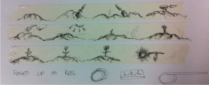
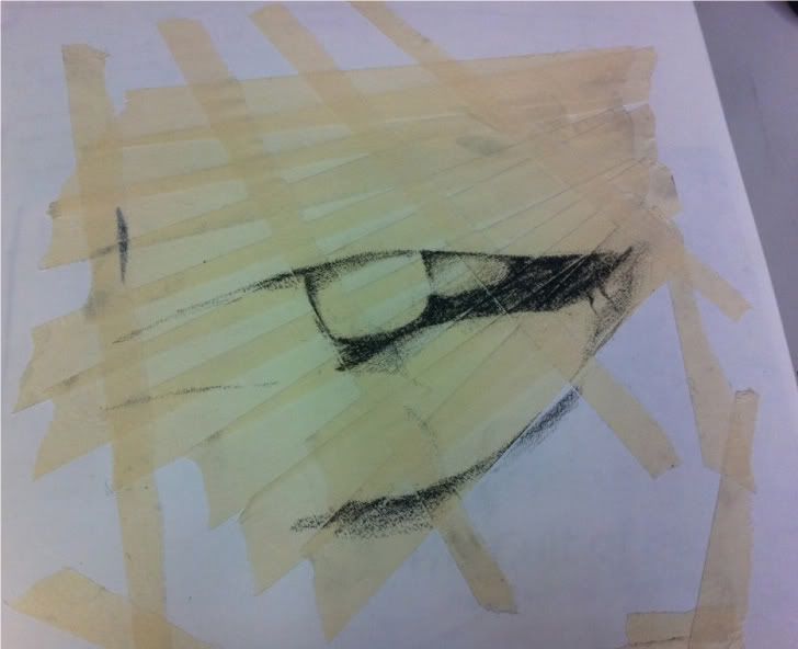
I really am having a lot of fun with masking tape! The texture is beautiful.

In these experiments I used a super soft graphite stick on the masking tape. This produced a very textured effect, with the cracks and grooves in the masking tape being emphasised under the graphite.

When choosing a subject for these experiments, I went for the first thing that came to my head. I tried not to think about it too much, because I have a tendency to overthink and give up otherwise.

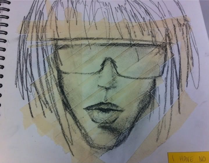
These weren't the most beautiful pieces but I like the contrast of the lines in the drawings and the lines in the masking tape.


Saturday, 9 April 2011

Neo-Innov: Pretty Mixed Media

Just a super quick one!

I love the mixed media feel of this work. I think this effect is created on photoshop, but I am loving the combination of text and drawing. It's really beautiful.

Loose and tight at the same time!

Florian Nicolle's website:
http://www.neo-innov.fr/

Thursday, 7 April 2011

Random idea

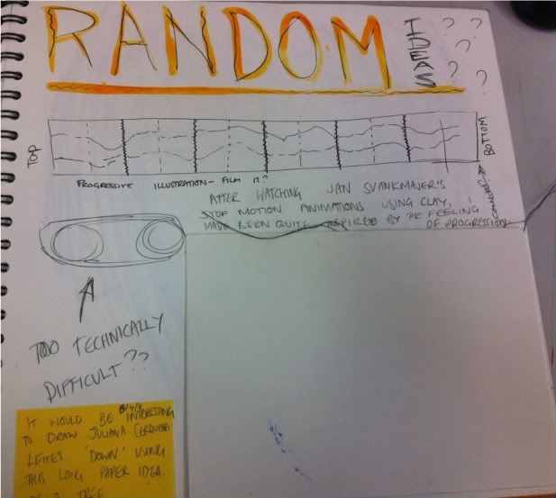
So I had this random idea today. Of doing something really long for my final piece.

I'm not sure exactly what it was inspired by, but it reminds me of one of the wall hangings at college and some of batool's concertina books.

My idea was to sew loads of pages together, much like the concertina style, and create a really long, progressive illustration.

Then I thought, could I attach this to some kind of wheel to create a loop? That way I could display it and have it turning round, attaching the end to the beginnning like a never ending story.

Just an idea.

Wednesday, 6 April 2011

Saatchi Gallery visit

When visiting the Saatchi Gallery today, I came across two artists that really stood out to me in terms of my work.

The first was Juliana Cerqueira Leite, with her piece 'Down'. Upon approaching it at first, I really wasn't a fan. I am not much of a fan of sculpture anyway so this piece didn't appeal much at all. However, after listening to a talk about the piece, I changed my mind.

Our guide explained that Leite had taken a large block of clay, and proceeded to climb through it, lower and lower, using her knees and feet to support herself. She then produced a plaster cast of the result. This opened my eyes to the feeling of progression and movement that the piece had, and, despite not loving the format of it, I admire the story she has given her work.

The second piece that caught my eye was one by Tessa Farmer, featuring a large glass tank full of tiny sculptures. These were made of dead insects and plant roots, carefully constructed into a battle between tiny creatures and insects.
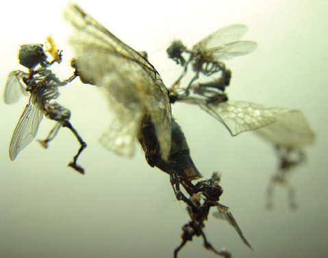
The way she used the dead, found objects to create such an exciting narrative is fascinating. I have always had a morbid fascination with dead bugs so this was really interesting!

It was amazing how she created such an atmosphere of chaos and destruction from simple, dead things. It really inspired me to create something beautiful from objects that are easily accessible for me, and to think outside of the box when thinking about how to use them.

Tuesday, 5 April 2011

V&A Museum: Cult of Beauty Exhibition

I also visited the Victoria and Albert Museum while I was in London this week. I was particularly interested in the Cult of Beauty exhibition after seeing the adverts for it around on the tube.

This exhibition featured a collection from the 'Cult of Beauty', otherwise known as the aesthetic movement; the whole concept of beauty for the sake of beauty. Art was meant to be beautiful and not necessarily reflect political or moral attitudes.

In the exhibition, three artists particularly caught my eye - Frederic Leighton, Frederick Walker and Aubrey Beardsley.

I will start with Aubrey Beardsley, it seems appropriate with a theme of illustration. Beardsley is one of the most famous pre 21st-century illustrators. His style was particularly extravagant and imaginative, often featuring elements of mythology.

I find the compositions of Beardsley's work fascinating; the flowing, organic style mixed with the tight illustrations produced a beautiful balance of looseness and detail.

Both Frederic Leighton and Frederick Walker used a technique that particularly related to my work & media experiments; they used brown paper with black and white chalks/gouache paints to bring shadows and highlights out of the page.

I will experiment using this technique in my media experiments.

Wednesday, 30 March 2011

REJOICE! I HAVE A THEME!

Hooray!

So after much pondering and lots of media research, I have finally made a decision. A theme that seems to be recurring in my work is that of a narrative - from using the stamps and creating a landscape from it, to creating the 'life story on an ink splat' and creating a story from all those messy accidents!

Therefore I have decided that my theme will be

Illustrating a Narrative using Mixed Media

Which is a little vague, but I would like to keep it open for now as I haven't completely decided on the format of my illustrations, or my narrative for that matter!

But yes, now I have a theme I feel like I have much more direction. Now to see where this takes me :)

Tuesday, 29 March 2011

Post-It note art, continued

So, I gave the post-it note method a try and found that I really struggled with being restricted to a small space. Naturally my work tends to be larger and grows from a small point, as opposed to being confined to an area like a post-it note.

It's amazing how I just could not cope with having such a small area to work in! I promtly returned to doodling and creating bigger images!

Polystyrene cups


Boey creates loads and loads of illustrations on plastic cups using permanent markers. I love the japanese-but-not-manga illustration feel of these. I might try this but it feels a bit too 3D for me.

Monday, 28 March 2011

Maisie 'Noodle Head' Noble

I found Masie Noble when researching the London College of Fashion BA Fashion Illustration course. Their students had created blogs documenting some of their research and experiments, and I really loved the simplicity of this piece below.

She has used some kind of ink or watercolour on top of a photograph, and then added detail using a fineliner or ink nib. The looseness of this, contrasted with the tightness of the photograph is fascinating. I love the concept of chance in it, having a limited amount of control over the ink, yet it creates such lovely shapes.


This one has a similar method of drawing on top of photos, using some gorgeous(!) gold and silver inks.

This reminds me of some etchings in the way it looks like the pattern has been scratched into the paper. It's also similar to some Julie Kaye's work in terms of drawing on a photo in a stylised way.
I may have to have a go at this!

Below I have linked another piece that Noble created using the gold ink. I LOVE the looseness of the image, and the flowy feel of the ink. SO pretty!
http://tinyurl.com/67o676k
Here is a link to her blog:
http://tinyurl.com/646mwqc

Sunday, 27 March 2011

'Wreck This Journal'

I found a fantastic book on amazon called 'Wreck This Journal' by Keri Smith.


The whole idea behind the book is to push your creativity as you literally wreck this journal! But in creative and fun ways. There is a single task on every page which you can interpret and complete in any way you like. It's all about getting creative.

I might try this with a book I already own, to help push some of my experiments.

Watch this space ;)

Saturday, 26 March 2011

Progress Review

I said in my statement of intent that I would be posting a weekly progress review in my blog, and as I haven't done that yet, I think perhaps I might start.

Where I am with my work:


  • Still unsure of theme however I have written the rest of my SOI

  • Lots of media experimentation done, yay

Where to go with the project:


  • I definitely want to incorportate the mixed media stuff into more of my work. It's really fascinating.

  • I still need to sort out my theme. I will give myself until the end of next week to decide.

Friday, 25 March 2011

RESPONSE: Drawing on Napkins

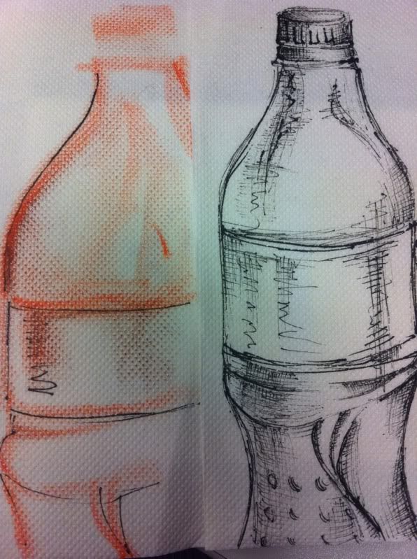
Here is my response to my previous post 'Drawing on Napkins'.

I used some cheap napkins I found at college, drawing on them with fineliner and chalk. I prefer the fineliner because of the way it bled very slightly, yet still produced a polished finish.

Thursday, 24 March 2011

Drawing on Napkins

After going out for lunch and doodling on a napkin while waiting for my food to arrive, I started to play with it a bit more and had a look on the internet to see if any other artists had really pushed napkins as a canvas for their work.

I came up with a couple, but they weren't completely what I imagined. They were quite simplistic in comparison to what I had in my mind. I was using fineliners on some cheap napkins which created quite a graphic effect.

http://www.flickr.com/photos/digioreo/sets/1494002/

The work of this artist was pretty simplistic but I liked the use of colour and the messages the work portrays. He creates a small piece of work on a napkin every day to give his children with their packed lunch, which is a really sweet touch. The idea that something so small can teach a life lesson each day is pretty cool!

http://drawingonnapkins.blogspot.com/

This is a bit more complex! 'Phil' uses napkins essentially as a sketchbook, doing life drawings, doodles and much m0re on these tiny pieces of tissue. He seems to use more pencils than fine liners/ink, which gives a much softer feel.


On the left is one life drawing I particularly liked, as it was done on a coloured napkin. Creating the shadows, shapes and highlights with white and black pencils is awesome!


Wednesday, 23 March 2011

Chopsticks and Ink.

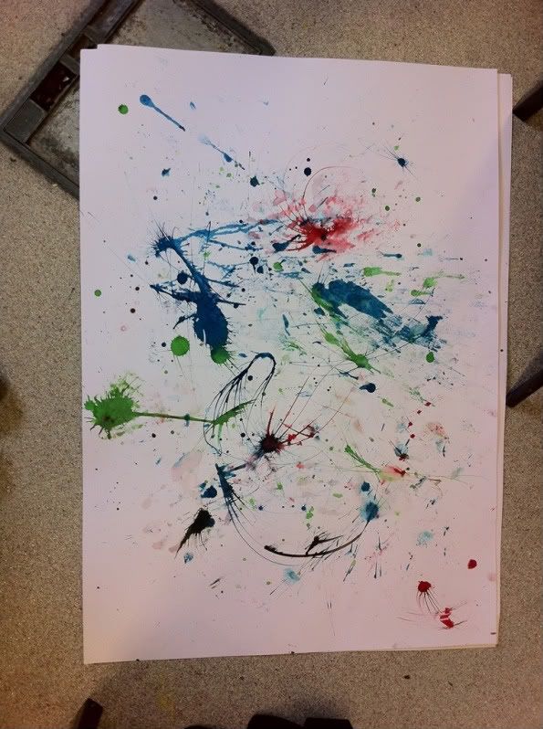
After dipping chopsticks in ink in my previous post, I have started experimenting more with it. It's SO FUN!

This was probably my most successful of the experiments I did. I just went with the flow of the lines and created this image of a woman's head. I had a bit of a problem locatiing where to put the nose but I think the final outcome worked quite well.

I'm thinking of creating more of these, perhaps on larger paper. I have decided to stray a little more away from fashion than I have in my recent projects, as my interests are starting to change and my personal style is developing.

I will continue to do some observational drawings using this technique of chopsticks and ink. It would be really interesting to do some life drawing like this!

It's interesting how this links to something I did earlier in the year using long twigs and black ink, to create an observational drawing of a wire sculpture I made. Funny that!

Tuesday, 22 March 2011

More Masking Tape...

Here's a little update of some of the work I have done with masking tape as a background. I like the texture created when masking tape is collaged together.


This was supposed to spell 'family' in the branches but wasn't so successful. However, you get the idea that it's a family tree I guess! This was just 2 fineliners of different thicknesses (0.5mm and 0.1mm) layered together to add shadow and definition.

Interesting!

Monday, 21 March 2011

Masking tape!

So, today I had the bright idea to draw on some masking tape. I had originally thought of drawing on matte scotch tape, however my pen wouldn't work on it! So I went with masking tape instead, until I get a permanent marker.

I was thinking of drawing a progressive story on the tape and then rolling it up. That way, as the tape is unrolled and used, the user witnesses the progression.

Here is what I got:
Turn the sound down!!


Apologies for the angle! I can't work out how to rotate it. Below is a photo of the tape I used.


This would be an interesting idea for an animation I think!

Sunday, 20 March 2011

I LOVE charity shops.

In Harrow Weald there is an amazing charity shop called 'St Luke's Hospice' where you can find some real gems.
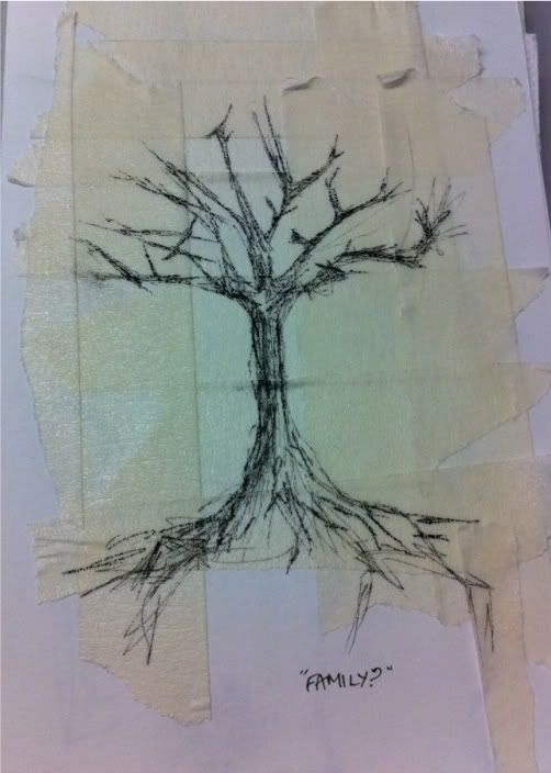
I visited the shop a couple of days ago, and found a huge box filled with bags of stamps. Old postage stamps, some of them dating back to before the first world war. A whole bag of about 100 was only £1.50! And so, I must confess, I bought 4. Why not eh! So I now have about 400 stamps coming from Poland, Germany, Czechslovkia and Italy. A nice range, I think!

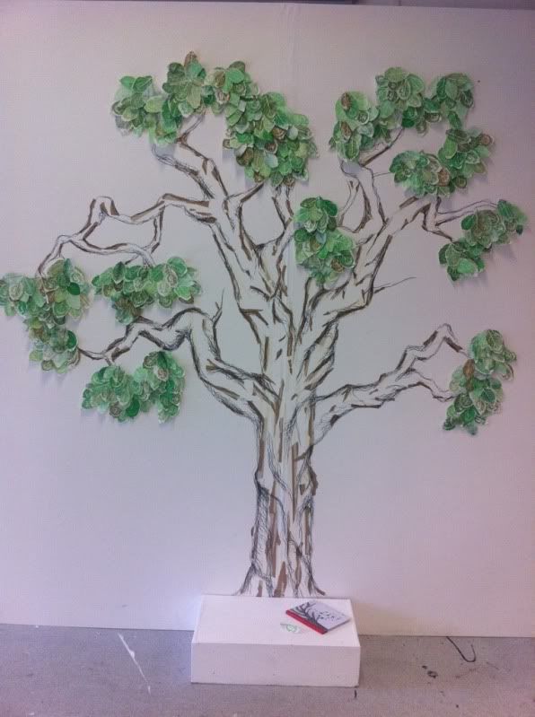
In the Polish bag, I found loads of animal stamps, which gave me an idea. Since seeing Mortensen's work on post-it notes, I wanted to have a go at thinking outside of the box and trying something really interesting with the stamps. I then started experimenting using the animals on the stamps as part of a bigger picture. I started by drawing a tree for my owl stamp.
To create the tree I used a disposable chop-stick dipped in ink, which I then rolled on the paper to create jerky, angular lines, much like twigs and sticks. I really enjoyed the stylistic effect that this produced.

This went on to me making a view of the sea with ship stamps floating on it. Unfortunately, it wasn't as successful. I think using the chopsticks created lines that were too straight to give the impression of water. I might try this again sometime with a different media.

Overall though, this is pretty fun!

Friday, 18 March 2011

Post-It note art


Sitting on the bus the other day, I came across an article on an artist called 'John Kenn Mortensen' - a Danish illustrator that has swapped regular sketchbooks for tiny, pocket-sized post-it notes. I saw his work and thought wow, what an amazing concept.

The way he creates such intricate, detailed drawings on tiny pieces of paper is so fascinating. His use of everyday objects as a canvas to produce art on is so inspiring! I am thinking of creating some of these myself - perhaps they won't be as polished, but I might aswell have a go! It will be nice to draw on something other than a large piece of paper. Perhaps I might do some mini-life drawing studies on a post it!

I shall post an update with some of my attempts.

http://www.metro.co.uk/weird/857952-artist-swaps-canvases-to-draw-on-the-humble-post-it-note

A little introduction

Hi, I'm Pippa.

I'm currently studying a foundation diploma in art and design, and this will be my new blog for my final major project (dun dun dunn!)

This project has an open theme, and right now I'm not completely sure what I want to do, so this is my little place that I shall be recording my journey. Here I will post research, useful links and references amongst other things. I might even post a little of my own work too.

Onwards and upwards!