Hooray!
So after much pondering and lots of media research, I have finally made a decision. A theme that seems to be recurring in my work is that of a narrative - from using the stamps and creating a landscape from it, to creating the 'life story on an ink splat' and creating a story from all those messy accidents!
Therefore I have decided that my theme will be
Illustrating a Narrative using Mixed Media
Which is a little vague, but I would like to keep it open for now as I haven't completely decided on the format of my illustrations, or my narrative for that matter!
But yes, now I have a theme I feel like I have much more direction. Now to see where this takes me :)
Wednesday, 30 March 2011
Tuesday, 29 March 2011
Post-It note art, continued
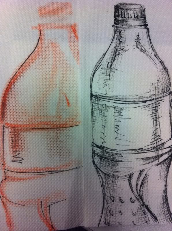
So, I gave the post-it note method a try and found that I really struggled with being restricted to a small space. Naturally my work tends to be larger and grows from a small point, as opposed to being confined to an area like a post-it note.
 It's amazing how I just could not cope with having such a small area to work in! I promtly returned to doodling and creating bigger images!
 It's amazing how I just could not cope with having such a small area to work in! I promtly returned to doodling and creating bigger images!
Polystyrene cups
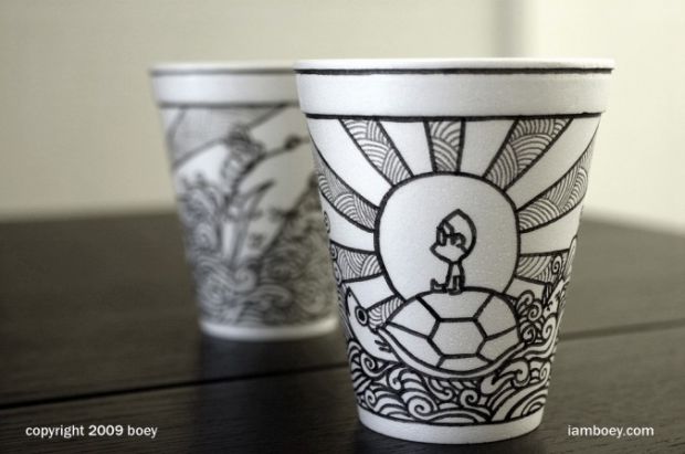
Boey creates loads and loads of illustrations on plastic cups using permanent markers. I love the japanese-but-not-manga illustration feel of these. I might try this but it feels a bit too 3D for me.
Monday, 28 March 2011
Maisie 'Noodle Head' Noble
I found Masie Noble when researching the London College of Fashion BA Fashion Illustration course. Their students had created blogs documenting some of their research and experiments, and I really loved the simplicity of this piece below.
She has used some kind of ink or watercolour on top of a photograph, and then added detail using a fineliner or ink nib. The looseness of this, contrasted with the tightness of the photograph is fascinating. I love the concept of chance in it, having a limited amount of control over the ink, yet it creates such lovely shapes.


This one has a similar method of drawing on top of photos, using some gorgeous(!) gold and silver inks.
This reminds me of some etchings in the way it looks like the pattern has been scratched into the paper. It's also similar to some Julie Kaye's work in terms of drawing on a photo in a stylised way.I may have to have a go at this!
Here is a link to her blog:
http://tinyurl.com/646mwqc
She has used some kind of ink or watercolour on top of a photograph, and then added detail using a fineliner or ink nib. The looseness of this, contrasted with the tightness of the photograph is fascinating. I love the concept of chance in it, having a limited amount of control over the ink, yet it creates such lovely shapes.
This one has a similar method of drawing on top of photos, using some gorgeous(!) gold and silver inks.
This reminds me of some etchings in the way it looks like the pattern has been scratched into the paper. It's also similar to some Julie Kaye's work in terms of drawing on a photo in a stylised way.
Below I have linked another piece that Noble created using the gold ink. I LOVE the looseness of the image, and the flowy feel of the ink. SO pretty!
http://tinyurl.com/67o676kHere is a link to her blog:
http://tinyurl.com/646mwqc
Sunday, 27 March 2011
'Wreck This Journal'
I found a fantastic book on amazon called 'Wreck This Journal' by Keri Smith.

The whole idea behind the book is to push your creativity as you literally wreck this journal! But in creative and fun ways. There is a single task on every page which you can interpret and complete in any way you like. It's all about getting creative.
I might try this with a book I already own, to help push some of my experiments.
Watch this space ;)
Saturday, 26 March 2011
Progress Review
I said in my statement of intent that I would be posting a weekly progress review in my blog, and as I haven't done that yet, I think perhaps I might start.
Where I am with my work:
Where I am with my work:
- Still unsure of theme however I have written the rest of my SOI
- Lots of media experimentation done, yay
Where to go with the project:
- I definitely want to incorportate the mixed media stuff into more of my work. It's really fascinating.
- I still need to sort out my theme. I will give myself until the end of next week to decide.
Friday, 25 March 2011
RESPONSE: Drawing on Napkins
 Here is my response to my previous post 'Drawing on Napkins'.
I used some cheap napkins I found at college, drawing on them with fineliner and chalk. I prefer the fineliner because of the way it bled very slightly, yet still produced a polished finish.
Thursday, 24 March 2011
Drawing on Napkins
After going out for lunch and doodling on a napkin while waiting for my food to arrive, I started to play with it a bit more and had a look on the internet to see if any other artists had really pushed napkins as a canvas for their work.
I came up with a couple, but they weren't completely what I imagined. They were quite simplistic in comparison to what I had in my mind. I was using fineliners on some cheap napkins which created quite a graphic effect.
http://www.flickr.com/photos/digioreo/sets/1494002/
The work of this artist was pretty simplistic but I liked the use of colour and the messages the work portrays. He creates a small piece of work on a napkin every day to give his children with their packed lunch, which is a really sweet touch. The idea that something so small can teach a life lesson each day is pretty cool!
http://drawingonnapkins.blogspot.com/
 This is a bit more complex! 'Phil' uses napkins essentially as a sketchbook, doing life drawings, doodles and much m0re on these tiny pieces of tissue. He seems to use more pencils than fine liners/ink, which gives a much softer feel.
On the left is one life drawing I particularly liked, as it was done on a coloured napkin. Creating the shadows, shapes and highlights with white and black pencils is awesome!
Wednesday, 23 March 2011
Chopsticks and Ink.
 After dipping chopsticks in ink in my previous post, I have started experimenting more with it. It's SO FUN!
This was probably my most successful of the experiments I did. I just went with the flow of the lines and created this image of a woman's head. I had a bit of a problem locatiing where to put the nose but I think the final outcome worked quite well.
I'm thinking of creating more of these, perhaps on larger paper. I have decided to stray a little more away from fashion than I have in my recent projects, as my interests are starting to change and my personal style is developing.
I will continue to do some observational drawings using this technique of chopsticks and ink. It would be really interesting to do some life drawing like this!
It's interesting how this links to something I did earlier in the year using long twigs and black ink, to create an observational drawing of a wire sculpture I made. Funny that!
Tuesday, 22 March 2011
More Masking Tape...
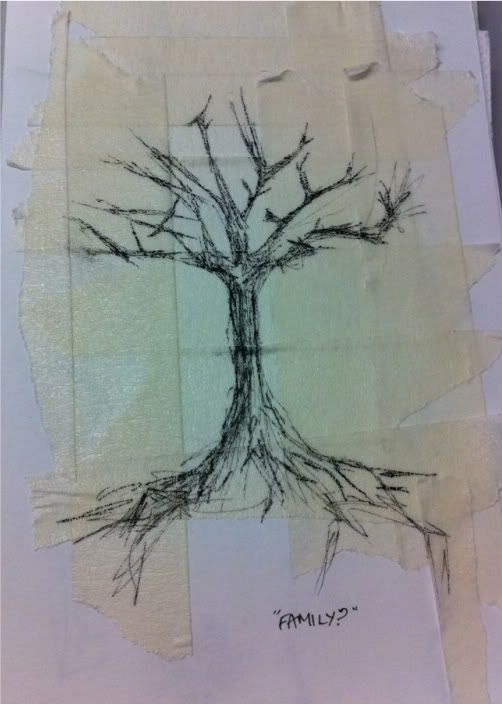
Here's a little update of some of the work I have done with masking tape as a background. I like the texture created when masking tape is collaged together.

This was supposed to spell 'family' in the branches but wasn't so successful. However, you get the idea that it's a family tree I guess! This was just 2 fineliners of different thicknesses (0.5mm and 0.1mm) layered together to add shadow and definition.
Interesting!
This was supposed to spell 'family' in the branches but wasn't so successful. However, you get the idea that it's a family tree I guess! This was just 2 fineliners of different thicknesses (0.5mm and 0.1mm) layered together to add shadow and definition.
Interesting!
Monday, 21 March 2011
Masking tape!
So, today I had the bright idea to draw on some masking tape. I had originally thought of drawing on matte scotch tape, however my pen wouldn't work on it! So I went with masking tape instead, until I get a permanent marker.
I was thinking of drawing a progressive story on the tape and then rolling it up. That way, as the tape is unrolled and used, the user witnesses the progression.
Here is what I got:
Turn the sound down!!
Apologies for the angle! I can't work out how to rotate it. Below is a photo of the tape I used.
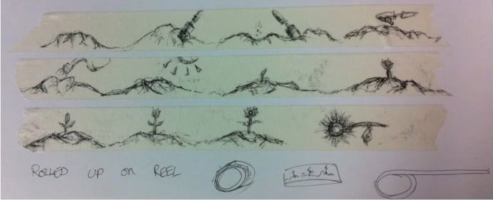
This would be an interesting idea for an animation I think!
Sunday, 20 March 2011
I LOVE charity shops.
In Harrow Weald there is an amazing charity shop called 'St Luke's Hospice' where you can find some real gems.
 I visited the shop a couple of days ago, and found a huge box filled with bags of stamps. Old postage stamps, some of them dating back to before the first world war. A whole bag of about 100 was only £1.50! And so, I must confess, I bought 4. Why not eh! So I now have about 400 stamps coming from Poland, Germany, Czechslovkia and Italy. A nice range, I think!
 In the Polish bag, I found loads of animal stamps, which gave me an idea. Since seeing Mortensen's work on post-it notes, I wanted to have a go at thinking outside of the box and trying something really interesting with the stamps. I then started experimenting using the animals on the stamps as part of a bigger picture. I started by drawing a tree for my owl stamp.
 To create the tree I used a disposable chop-stick dipped in ink, which I then rolled on the paper to create jerky, angular lines, much like twigs and sticks. I really enjoyed the stylistic effect that this produced.
This went on to me making a view of the sea with ship stamps floating on it. Unfortunately, it wasn't as successful. I think using the chopsticks created lines that were too straight to give the impression of water. I might try this again sometime with a different media.
Overall though, this is pretty fun!
Friday, 18 March 2011
Post-It note art

Sitting on the bus the other day, I came across an article on an artist called 'John Kenn Mortensen' - a Danish illustrator that has swapped regular sketchbooks for tiny, pocket-sized post-it notes. I saw his work and thought wow, what an amazing concept.
The way he creates such intricate, detailed drawings on tiny pieces of paper is so fascinating. His use of everyday objects as a canvas to produce art on is so inspiring! I am thinking of creating some of these myself - perhaps they won't be as polished, but I might aswell have a go! It will be nice to draw on something other than a large piece of paper. Perhaps I might do some mini-life drawing studies on a post it!
I shall post an update with some of my attempts.
http://www.metro.co.uk/weird/857952-artist-swaps-canvases-to-draw-on-the-humble-post-it-note
A little introduction
Hi, I'm Pippa.
I'm currently studying a foundation diploma in art and design, and this will be my new blog for my final major project (dun dun dunn!)
This project has an open theme, and right now I'm not completely sure what I want to do, so this is my little place that I shall be recording my journey. Here I will post research, useful links and references amongst other things. I might even post a little of my own work too.
Onwards and upwards!
Subscribe to:
Comments (Atom)