http://www.guardian.co.uk/artanddesign/2009/sep/19/paul-noble-how-he-draws
This guy draws lots and lots of tiny drawings and links them together in different ways.
Just an interesting reference :)
Saturday, 30 April 2011
Friday, 29 April 2011
Chinese Scroll Paintings
 An interesting reference to my rolled up masking tape idea.
Chico mentioned seeing some chinese scroll paintings that had a similar concept; they would be rolled and unrolled to reveal a narrative.
This could be a possible format to my final piece ;)
Monday, 25 April 2011
Steve McQueen - Queen and Country

Just a quick one.
I came across this guy after a tutorial at college. He had created hundreds of postage stamps with the portraits of soldiers who had given their lives in Iraq. Unfortunately, the Royal Mail never used them, despite long petitions and campaigns even from the families.

What is beautiful is that he has created such tiny tributes that open up into a whole story, almost creating a narrative from the photos. The whole 'point' of the work is for the viewer to think about the subject of the stamps, and the ultimate sacrifice they paid.
It is interesting how supportive most families were of the project. I would have expected more people to object to it than the 20% of families approached.
What a beautiful tribute!
The website:
http://www.artfund.org/queenandcountry/Queen_and_Country.html
Friday, 22 April 2011
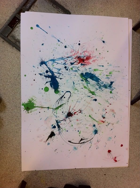
Making a really big mess
I went really crazy with ink today. Really splatting ink, putting wet fingerprints and scratching into it. It was fun!


Saturday, 16 April 2011
Even more masking tape. LOVE IT
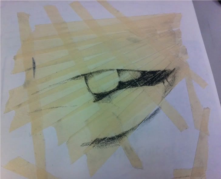 I really am having a lot of fun with masking tape! The texture is beautiful.
In these experiments I used a super soft graphite stick on the masking tape. This produced a very textured effect, with the cracks and grooves in the masking tape being emphasised under the graphite.
When choosing a subject for these experiments, I went for the first thing that came to my head. I tried not to think about it too much, because I have a tendency to overthink and give up otherwise.
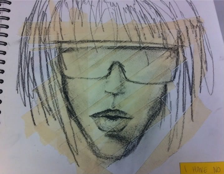 These weren't the most beautiful pieces but I like the contrast of the lines in the drawings and the lines in the masking tape.
Saturday, 9 April 2011
Neo-Innov: Pretty Mixed Media
 Just a super quick one!
I love the mixed media feel of this work. I think this effect is created on photoshop, but I am loving the combination of text and drawing. It's really beautiful.
Loose and tight at the same time!
Florian Nicolle's website:
http://www.neo-innov.fr/
Thursday, 7 April 2011
Random idea
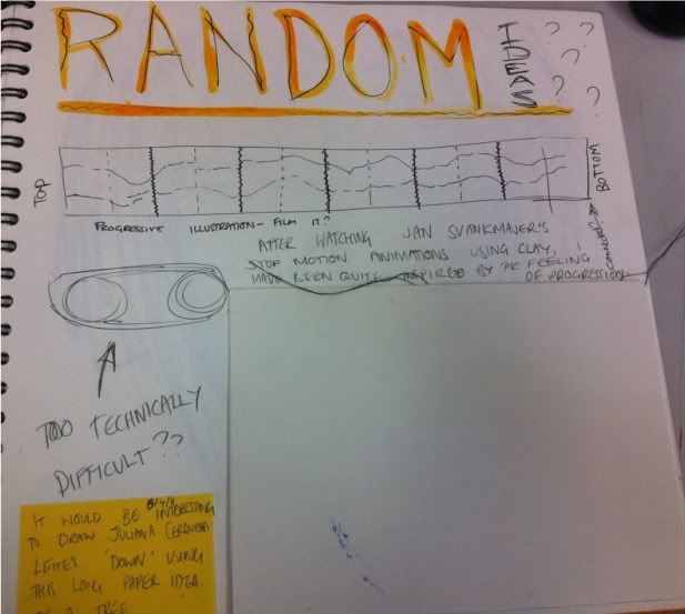 So I had this random idea today. Of doing something really long for my final piece.
I'm not sure exactly what it was inspired by, but it reminds me of one of the wall hangings at college and some of batool's concertina books.
My idea was to sew loads of pages together, much like the concertina style, and create a really long, progressive illustration.
Then I thought, could I attach this to some kind of wheel to create a loop? That way I could display it and have it turning round, attaching the end to the beginnning like a never ending story.
Just an idea.
Wednesday, 6 April 2011
Saatchi Gallery visit
 When visiting the Saatchi Gallery today, I came across two artists that really stood out to me in terms of my work.
The first was Juliana Cerqueira Leite, with her piece 'Down'. Upon approaching it at first, I really wasn't a fan. I am not much of a fan of sculpture anyway so this piece didn't appeal much at all. However, after listening to a talk about the piece, I changed my mind.
Our guide explained that Leite had taken a large block of clay, and proceeded to climb through it, lower and lower, using her knees and feet to support herself. She then produced a plaster cast of the result. This opened my eyes to the feeling of progression and movement that the piece had, and, despite not loving the format of it, I admire the story she has given her work.
The second piece that caught my eye was one by Tessa Farmer, featuring a large glass tank full of tiny sculptures. These were made of dead insects and plant roots, carefully constructed into a battle between tiny creatures and insects.
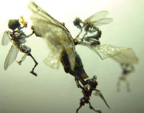 The way she used the dead, found objects to create such an exciting narrative is fascinating. I have always had a morbid fascination with dead bugs so this was really interesting!
It was amazing how she created such an atmosphere of chaos and destruction from simple, dead things. It really inspired me to create something beautiful from objects that are easily accessible for me, and to think outside of the box when thinking about how to use them.
Tuesday, 5 April 2011
V&A Museum: Cult of Beauty Exhibition
I also visited the Victoria and Albert Museum while I was in London this week. I was particularly interested in the Cult of Beauty exhibition after seeing the adverts for it around on the tube.
This exhibition featured a collection from the 'Cult of Beauty', otherwise known as the aesthetic movement; the whole concept of beauty for the sake of beauty. Art was mean t to be beautiful and not necessarily reflect political or moral attitudes.
In the exhibition, three artists particularly caught my eye - Frederic Leighton, Frederick Walker and Aubrey Beardsley.
I will start with Aubrey Beardsley, it seems appropriate with a theme of illustration. Beardsley is one of the most famous pre 21st-century illustrators. His style was particularly extravagant and imaginative, often featuring elements of mythology.

I find the compositions of Beardsley's work fascinating; the flowing, organic style mixed with the tight illustrations produced a beautiful balance of looseness and detail.
Both Frederic Leighton and Frederick Walker used a technique that particularly related to my work & media experiments; they used brown paper with black and white chalks/gouache paints to bring shadows and highlights out of the page.
I will experiment using this technique in my media experiments.
This exhibition featured a collection from the 'Cult of Beauty', otherwise known as the aesthetic movement; the whole concept of beauty for the sake of beauty. Art was mean
 t to be beautiful and not necessarily reflect political or moral attitudes.
In the exhibition, three artists particularly caught my eye - Frederic Leighton, Frederick Walker and Aubrey Beardsley.
I will start with Aubrey Beardsley, it seems appropriate with a theme of illustration. Beardsley is one of the most famous pre 21st-century illustrators. His style was particularly extravagant and imaginative, often featuring elements of mythology.

I find the compositions of Beardsley's work fascinating; the flowing, organic style mixed with the tight illustrations produced a beautiful balance of looseness and detail.
Both Frederic Leighton and Frederick Walker used a technique that particularly related to my work & media experiments; they used brown paper with black and white chalks/gouache paints to bring shadows and highlights out of the page.
I will experiment using this technique in my media experiments.
Subscribe to:
Comments (Atom)